Visualizing Beer Styles
How to see the relationships between beer styles. This is a puzzle I've toyed with since 2011, when I was working on the Beer Bible. There's a feature in the book in which, near the end of each style chapter, a sidebar offers other close styles for people to try ("If you like pale ale, try..."). What I discovered was that the flavors of beer styles don't necessarily match the national tradition or broad category (ales and lagers, say). Maibocks and French bière de gardes are very similar, for example.
Over the weekend, I tried yet another version of this (you have been spared earlier versions). It is not a beautiful infographic, because I'm a writer, not a visual design guy. And there's no way to pull this off in two dimensions without overly simplifying it. As a consequence, it will never be a fully immersive and complete way to think about beer styles. People will recognize that "neutral" and "expressive" yeasts correspond to ales and lagers, but the latter terms don't tell you what their flavor differences are. So it seemed to make sense to describe them on the flavor continuum on which they actually run. Have a look (and click to enlarge):
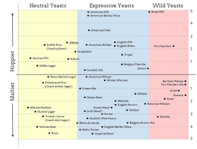
Irish stout, for example, doesn't work so well because it has nearly equal intensities of hop and malt. You can't very well average the two, since both flavors are pronounced (compared to, say, helles), so I was forced to choose. Most styles do fairly well on the chart, though, I think. This seems better than some of the beeriodic tables and various other visualizers I've seen.
Thoughts?
Over the weekend, I tried yet another version of this (you have been spared earlier versions). It is not a beautiful infographic, because I'm a writer, not a visual design guy. And there's no way to pull this off in two dimensions without overly simplifying it. As a consequence, it will never be a fully immersive and complete way to think about beer styles. People will recognize that "neutral" and "expressive" yeasts correspond to ales and lagers, but the latter terms don't tell you what their flavor differences are. So it seemed to make sense to describe them on the flavor continuum on which they actually run. Have a look (and click to enlarge):
Irish stout, for example, doesn't work so well because it has nearly equal intensities of hop and malt. You can't very well average the two, since both flavors are pronounced (compared to, say, helles), so I was forced to choose. Most styles do fairly well on the chart, though, I think. This seems better than some of the beeriodic tables and various other visualizers I've seen.
Thoughts?